How to

Choose the perfect paint colour by using Resene testpots

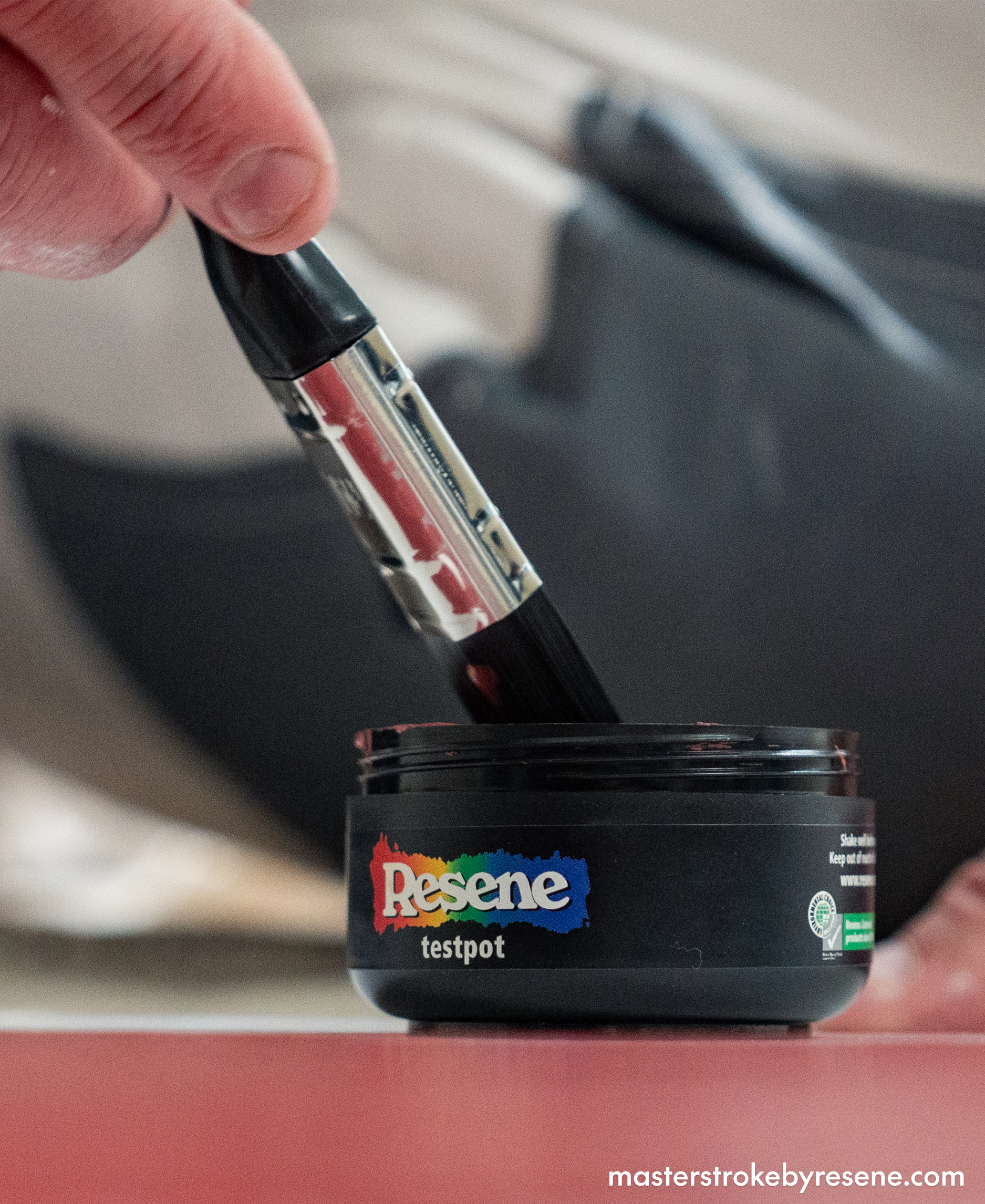
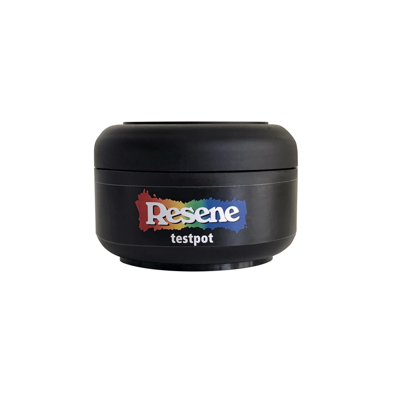
Good things come in small packages and Resene testpots are a great example. These handy little tubs of paint colour are the best way to help you choose the perfect colours for your project. And with the widest range of testpots in New Zealand, Resene ColorShops are the testpot mothership. 

Why use Resene testpots?

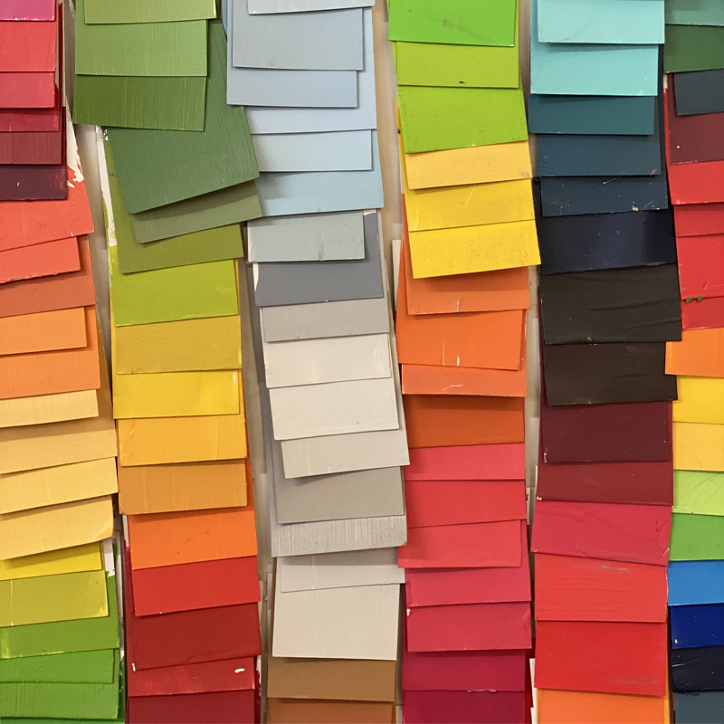
While paint samples on colour charts are a great starting point to help you narrow down your favourites, you need to see a bigger swatch to get a good idea of how the colour will look once it’s painted on a wall. Variations in the colour – such as the undertone or the light reflective value (LRV) – might seem small on the paint sample, but become much more obvious once they are on the wall or placed next to other shades. Colours that look good in the store may look different when in the light conditions of your home.

How to use Resene testpots

Once you’ve chosen the colours you want to try, here’s how to get the most out of your testpots.

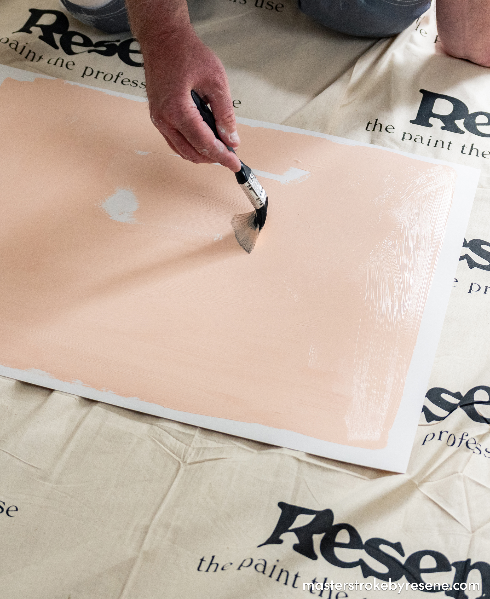
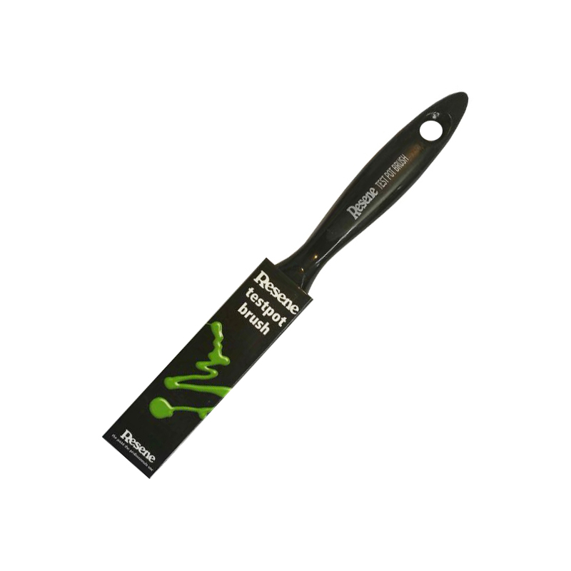
Don’t paint directly onto your wall, as the existing colour will affect the appearance of the new colour. Use your Resene testpots to create your own swatches instead. To create a test swatch, take a piece of A3-sized white card and apply two coats of your chosen Resene colour using a Resene testpot brush, leaving an unpainted border around the edge. 

Allow the card to dry and use Blu-Tack to attach the card to the wall so it’s nice and flat. Observe the swatch at different times of the day and night to see how the colour changes with different amounts of daylight and under artificial light. Move the swatch onto other walls or rooms to make the same observations. A colour will look quite different in a north-facing room with lots of light compared to a darker south-facing room. 

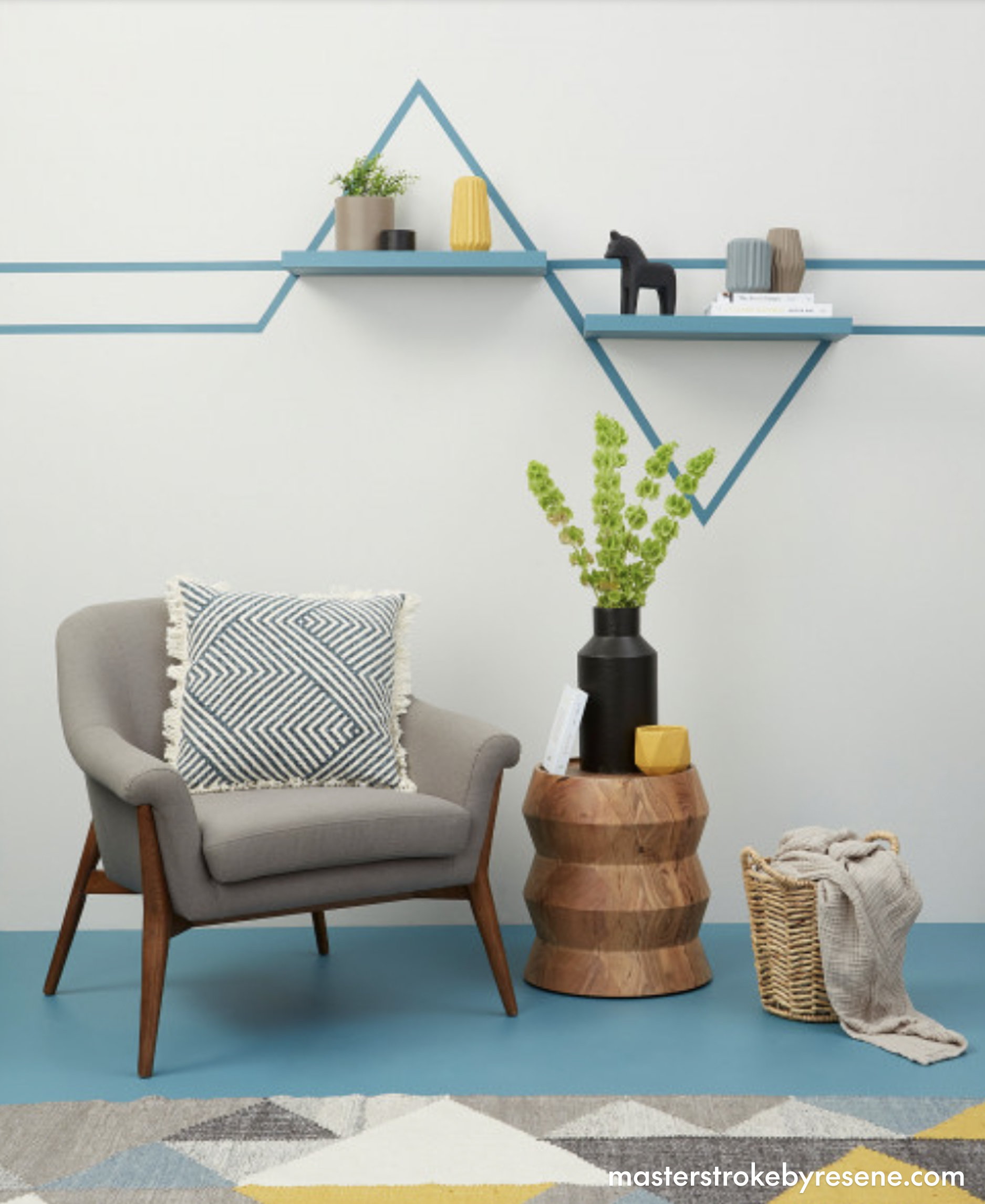
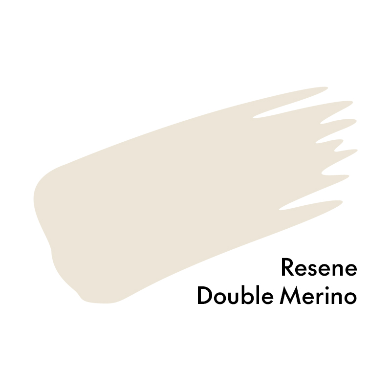
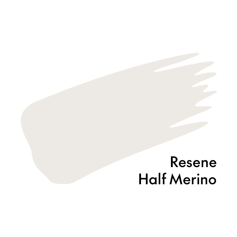
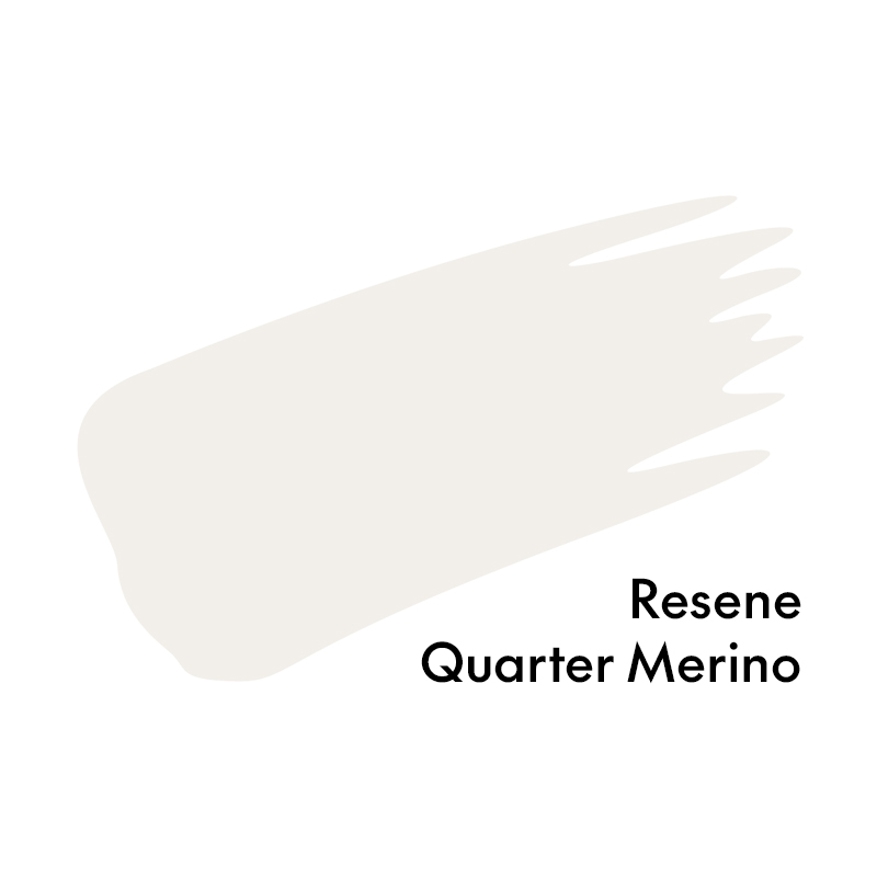
If you plan on painting all the walls in your home the same colour, you may need to choose colours from the same colour family but vary the strength from room to room. For example, paint a sunny north-facing lounge in Resene Double Merino and a darker south-facing bedroom in Resene Half Merino. Generally, it pays to have a mid-strength colour on the walls (e.g., Resene Double Merino) and the lightest colour on the ceiling and trims (Resene Quarter Merino). This is because there is less light on the ceiling so it will appear darker.

Resene testpots are the best way to help you choose the perfect colours for your projects.
Don’t paint directly onto the wall – instead apply two coats onto a piece of white card, leaving leave a border around the edge.
A clever way to use up your leftover Resene testpot paint is to create some wall art. These graphic lines and shelves have been painted in Resene Bismark.

Colours decoded and more colour tips

If you’ve tried a few testpots and you’re still not finding the right colour, understanding colour codes and other colour basics can help guide you further down the right path.

Each Resene paint colour has a code which tells us different information about the colour, for example the colour code for the bright yellow Resene Turbo is Y84-198-087.

The first letter in the code refers to the colour palette or family of colours it belongs to: B = Blue, Y = Yellow, R = Red, O = Orange, G = Green, V = Violet, BR = Brown, M = Metallics and N = Neutral.

The first two numbers in the code refer to the luminance or brightness of the colour, with zero as black and 100 as close to white. 

The second set of numbers indicates the saturation of the colour. The saturation refers to the pureness or the amount of grey in a colour. The lower the number, the more grey there is, the higher the number the more pure it is. To desaturate a colour in a paint system you can add tints of white, grey, black or the hue’s complementary (opposite) colour.

The last three digits of the number refer to the colour’s position on the colour wheel.

Understanding the Resene colour wheel will give you better insight into the breakdown of each colour and the family it belongs to.

Pay particular attention to the tone and saturation of a paint colour. Often colours that look quite grey or muted on a colour sample will look much more colourful when painted on your walls, while more saturated colours with fewer grey tones can appear much more vibrant and intense. For example, Resene Duck Egg Blue appears quite grey on its colour chart, but on the wall it’s an unmistakable shell blue. Meanwhile, Resene Comfortably Numb looks like a soft pale blue on its colour chart, but because it has fewer grey undertones than Resene Duck Egg Blue it will look icier. Each colour has a description on the back of the colour chart that can also help you understand the colour and other colours that might be complementary.

Don’t be blinded by the light!

Another thing to pay attention to on the colour chart is the light reflectance value (LRV). This indicates the proportion of light a colour reflects. Black absorbs all colour and will have an LRV of 0%, while white is nearly 100% meaning it will reflect a lot of light and might produce glare. Varying the sheen level of your paint will also affect how your paint looks.

For example, colours in a matte finish like Resene SpaceCote Flat for interiors or Resene Lumbersider Matt on exteriors will look moodier and earthier than the same colours in semi-gloss paints such as Resene Sonyx 101 for exteriors or Resene Lustacryl for trims and doors. Glare and LRV are particularly important to consider on exteriors. Consider choosing a Resene CoolColour version of your colour for dark exterior colours, it’s a special paint formula which contains heat-reflective technology.

Also, it pays to check in advance with your local council or Building Control Authorities as there may be special restrictions on exterior paint LRV.

About MasterStroke by Resene
MasterStroke by Resene is here to help you master your paint and decorating DIY projects. Brush up on your skills with advice, tips and ideas from our trusted experts.

Check out the latest how-to videos on our YouTube channel.