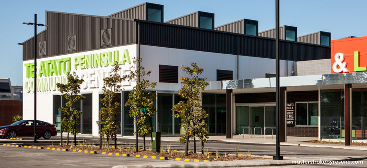
As director at Auckland-based practice Moller Architects, Craig Moller heads a team of 15 alongside his father Gordon. The studio’s work is wide-ranging, from the Sky Tower to chocolate factories, boat-building sheds, community venues, schools, houses and hotels. Colour and paint form an important part of Craig’s practice, and he tells MasterStroke people shouldn’t be afraid of using colours.
What drew you to a career in architecture?
Growing up, I have memories of driving around looking at houses with my father, who was aghast at some of the questionable suburban development going on. It was my father who designed the house we grew up in and when we moved, he made significant alterations to our next house.
Even though I probably didn’t realise it at the time, conversations about design and space were very much part of my upbringing. It wasn’t until my final year of school that I began to consider architecture. Though I’d always enjoyed drawing, it was cars, boats and trucks that interested me. For a long time, I dreamed of being a car designer but thought it wasn’t possible.
What is it about architecture that excites you?
My daughter Claudia and I were talking the other day about someone who’d been in the same job for 40 years. She said, “Well Dad, you’ve done the same job for a long time, too.” That’s true, it’s nearly 30 years since I started practising, but the thing with architecture is there’s a huge variety of projects so it never feels boring.
Every project we take on is different. The locations change, the clients are different, every budget and brief are unique. This variety makes it challenging, but it’s also what makes the job so interesting. People think architecture is about designing houses and then they get built, but it’s more wide-ranging than that. A lot of what we do is about giving advice, which could be choosing a site to build on, or advising local school boards about property decisions. I also teach at the University of Auckland School of Architecture. I find it very rewarding to be part of guiding the next generation of architects.
How does colour come into your practice?
There are no hard and fast rules about colour, it’s a very personal thing, but there’s no doubt that colour, form and space all have an ability to affect people for better or worse. Colour can be restful, it can add drama, it can add personality and grab attention. It can also be used with restraint, or in ways that mirror the natural environment.
How do you use colour in your own home?
When my wife and I bought our old two-storey Victorian home in Freemans Bay, Auckland, it was pretty tired, so we immediately painted the whole thing in an off-white called Resene Alabaster. That just freshened it up and made it liveable while we worked out our next steps. Over the years, we’ve painted every room a different colour to give each space its own identity.
We have a small toilet tucked in under the stairs that has no natural light, so we painted it Resene Bivouac Green. Some people might hate it, but I’m drawn to browns. We have a small study room filled with books, and that’s painted in an eggshell blue called Resene Powder Blue, which is part of the Karen Walker Paints range. Our living room is painted in Resene Donkey Brown, a cosy sort of warm blue-grey colour.
As well as browns, I like orange, too, and perhaps that’s because I grew up in the 70s when those colours were everywhere. Our kitchen and dining room is painted in soft pink, Resene Blanched Pink, which I find very restful. I like my living spaces to feel calming.
What advice would you give others when it comes to using colour?
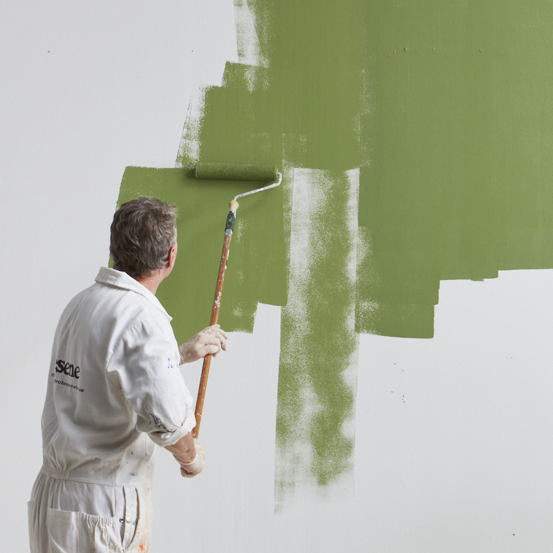
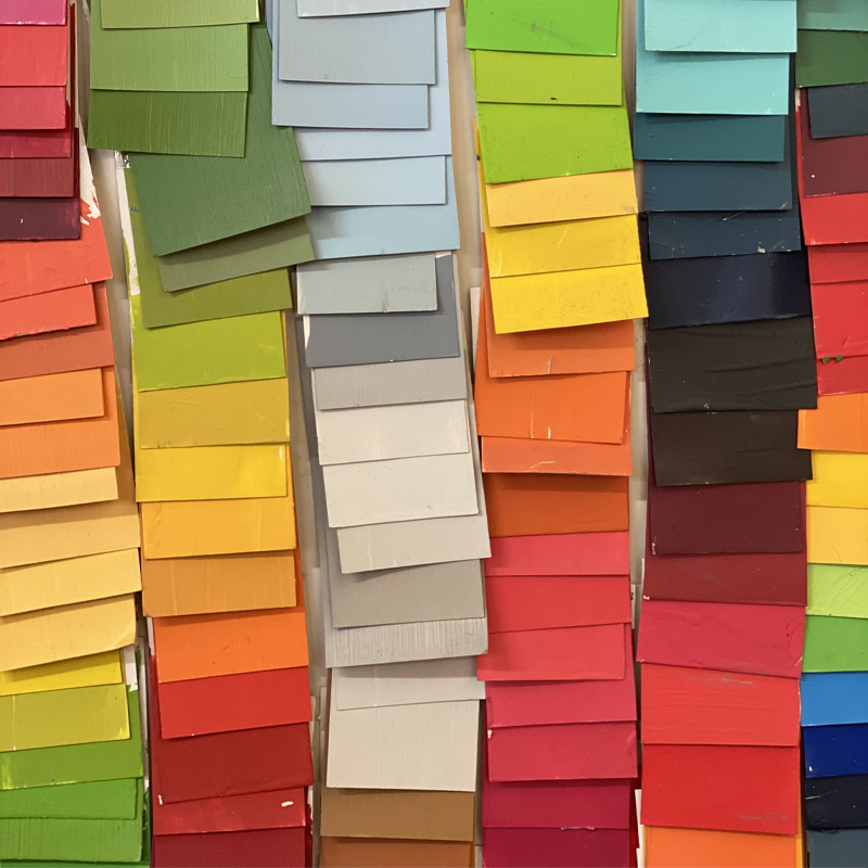
Like with many things in life, it’s the getting started that’s often the hardest part. There’s a tendency to be overwhelmed by the sheer choice of paint colours available, so the first thing I’d do is reduce those choices. Resene colour charts and Resene testpots are great, but try not to take too many options home with you. Avoid slapping on 10 different colours to your walls, try to stick to trying out two or three at the most.
When I was choosing paint for my own home, I used only colours from the Karen Walker Paints range from Resene. They all work well together, but it also meant it was easier to make decisions with fewer choices. We used Resene Powder Blue in the front room, Resene Heathered Grey in the hall, Resene Blanched Pink in the stairway, with doors in Resene Sanguine Brown and one in Resene Weathered Orange.
My biggest advice is to just choose a room and get started. Paint is a relatively inexpensive way to change a room, and there’s satisfaction in being able to do that so quickly. If the worst happens and you don’t like it, you can always paint it back.
Are you a DIYer?
I am definitely a DIYer when it comes to painting! It’s something my father always did himself, and as a student I would often paint people’s houses as part time work, and now, I’ve painted all the rooms in our house. I’m not particularly good at it, my painting is a bit rough in patches, but that’s never bothered me too much. Architecture can be all-encompassing, so I find the manual labour of painting to be quite therapeutic.