Ask an expert

Top tips from Resene Colour Consultant Connor Watson

While the thought of choosing a colour scheme for one room – let alone a whole house – can cause confusion and pure fear in some of us, the good news is that Resene Colour Consultants are here to help! They are qualified, incredibly experienced and ready to assist with any advice, insight and tips you might need. 

We chat to Connor Watson about his passion for colour, how he assists his clients, and what upcoming trends we should look out for.

How do you describe yourself and what you do?

I’m a Colour Consultant with Resene, working closely with clients to build spaces that reflect who they are. It’s all about listening, observing and translating that into a palette that has the feeling they want to create.

What do you love about working at Resene?

The creativity and variety. Every client is different, and every home has its own quirks and possibilities. I also love being part of a brand people genuinely trust. Resene is a household name, so clients come in open-minded, knowing they’ll get quality and care.

What does a typical day look like for you?

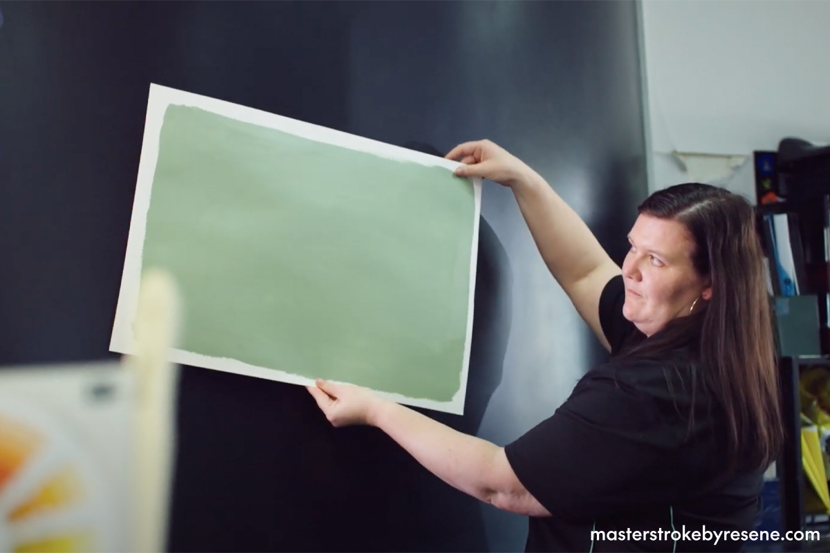
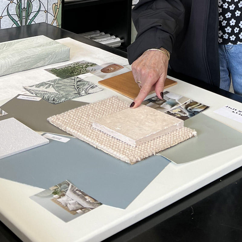
My day can include in-store consultations, on-site visits, and putting together customised colour specs or visualisation renders. I’ll often be reviewing samples under different lighting conditions, checking compatibility with flooring or fabrics and doing follow-ups.

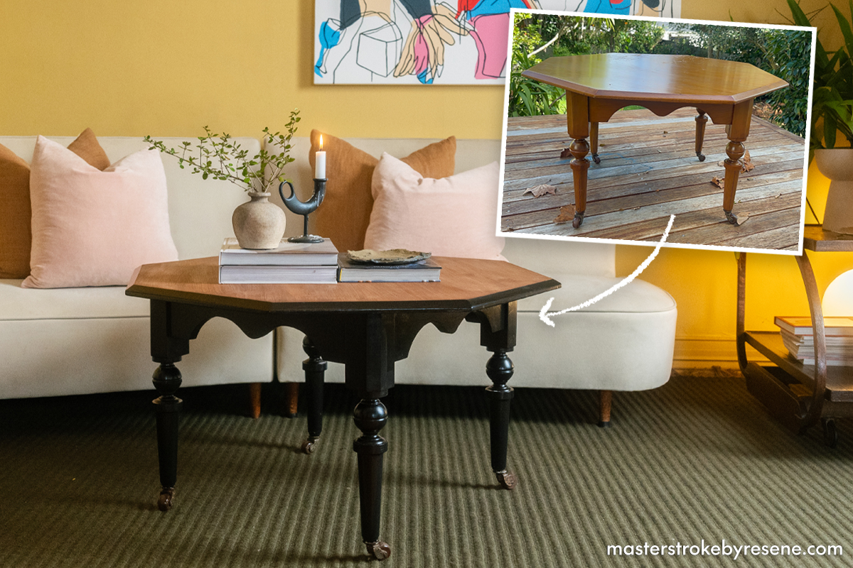
What’s the easiest painting job you’d recommend to a beginner?

Painting a small piece of furniture or doing a feature wall is a perfect entry point. It gives people a chance to test colour and technique without the commitment of an entire room.

What are the key issues people face when choosing colour?

Lighting is one of the biggest factors. A colour can look completely different in natural light versus artificial or shadowed areas. Another challenge is trying to make new colours work with existing features like flooring, cabinetry or tiles, which often have undertones people don’t immediately notice.

Painting a small piece of furniture is a great way to start introducing more colour into your home confidently. Coffee table base painted in Resene Lustacryl in Resene Nero and table top stained in Resene Colorwood in Resene Walnut.
When you paint a Resene testpot onto A2 card, remember to isolate the colour by leaving an unpainted border and then move the card around the room to see how the light hits it. This painted swatch is in Resene Field Day.

What’s your best advice to customers when choosing colour?

Trust your instincts, but test them. Use Resene testpots painted onto pieces of A2 card and move them around the room at different times of day. Also, consider how you want the space to feel, not just how it looks. Colour can really shape emotion and mood.

How do you guide people through the process?

I always start with a conversation, getting to know the space and the person using it. From there, I pull together colours that work practically and tonally. I try to give a few confident choices that make the decision easier and more exciting, rather than overwhelming.

What are your tips for making a room look and feel more inviting?

Add warmth, even in a modern scheme. Colours with soft or earthy undertones instantly make a space feel more lived-in. Layering with texture, paint finishes and lighting also brings life to a room. You want a space that feels like it’s being used and enjoyed.

What inspires you?

Film and games – the art of world-building and how colour is used to create immersive, emotional spaces. I’m also really inspired by New Zealand’s natural misty greens, coastal greys and the deep browns of the bush.

Do you have any projects planned for your place over spring and summer?

Yes! I’m planning to clear out the area between my garage and my house and apply Resene Concrete Wax. It seals and smooths the surface, making it more durable and easier to move across – great for everything from foot traffic to weekend skating sessions.

What are the key colour trends for 2026?

We’re moving into a more confident, expressive space – think rich terracottas, clay tones, deep greens and saturated blues and golds. People want colour that feels intentional, rooted and emotional.

How have these trends evolved from the past?

We’ve stepped away from the cooler, minimalist greys and safe whites. Now it’s about warmth, personality and letting colour really shape how a space feels. It’s less about blending in and more about creating connection.

What Resene wallpapers are capturing this mood?

Strong Kiwiana-inspired trends are emerging, especially in the latest Aspiring Walls collections, with a focus on bringing nature indoors. Murals are also gaining popularity, adding visual interest without needing to cover a full wall.

How can we bring these trends into our homes with confidence?

Start small with a feature wall, a hallway or a powder room. Those are perfect places to play with bold colour or wallpaper. Pair them with grounding neutrals or natural textures.

What’s your advice for going bolder with colour?

Go all in. When you try to tone it down too much, it can lose impact. A bold colour used with intention looks elegant and confident. Pair it with lighting and styling that complement the mood and it’ll feel purposeful, not overwhelming.

About MasterStroke by Resene
MasterStroke by Resene is here to help you master your paint and decorating DIY projects. Brush up on your skills with advice, tips and ideas from our trusted experts.

Check out the latest how-to videos on our YouTube channel.