Ask an expert

Frequently asked questions about choosing paint colours

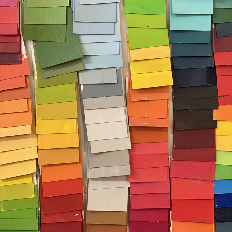
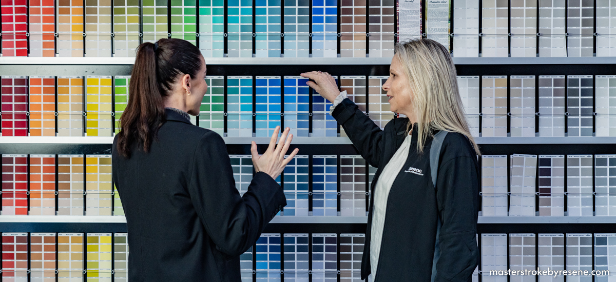
One of the trickiest parts of any paint project is deciding which colour to use – especially when Resene has thousands to choose from. Enter Resene Colour Expert Meryl Southey, one of an incredibly knowledgeable, experienced team who provide guidance, tips and advice to Resene customers. 

Meryl takes us through the seven of the most popular questions that are asked via the Resene Ask a Colour Expert online form and provides valuable insight in response. Chances are you have asked one or more of these questions yourself over the years, so read on for the expert intel on choosing the right paint colours for your space.

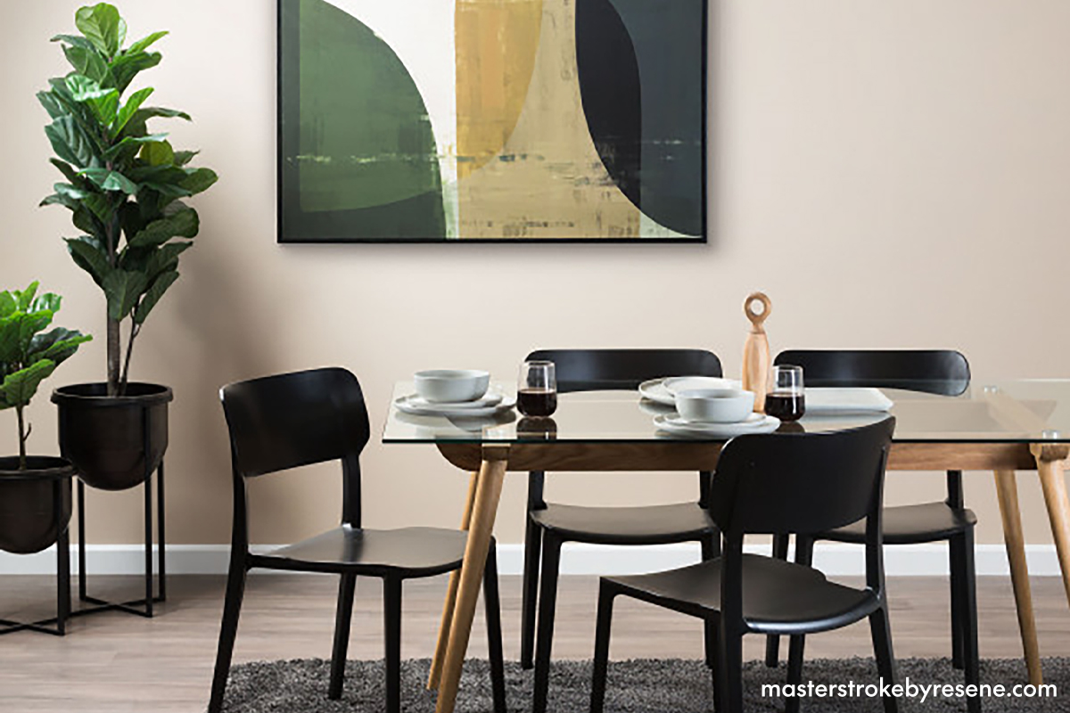
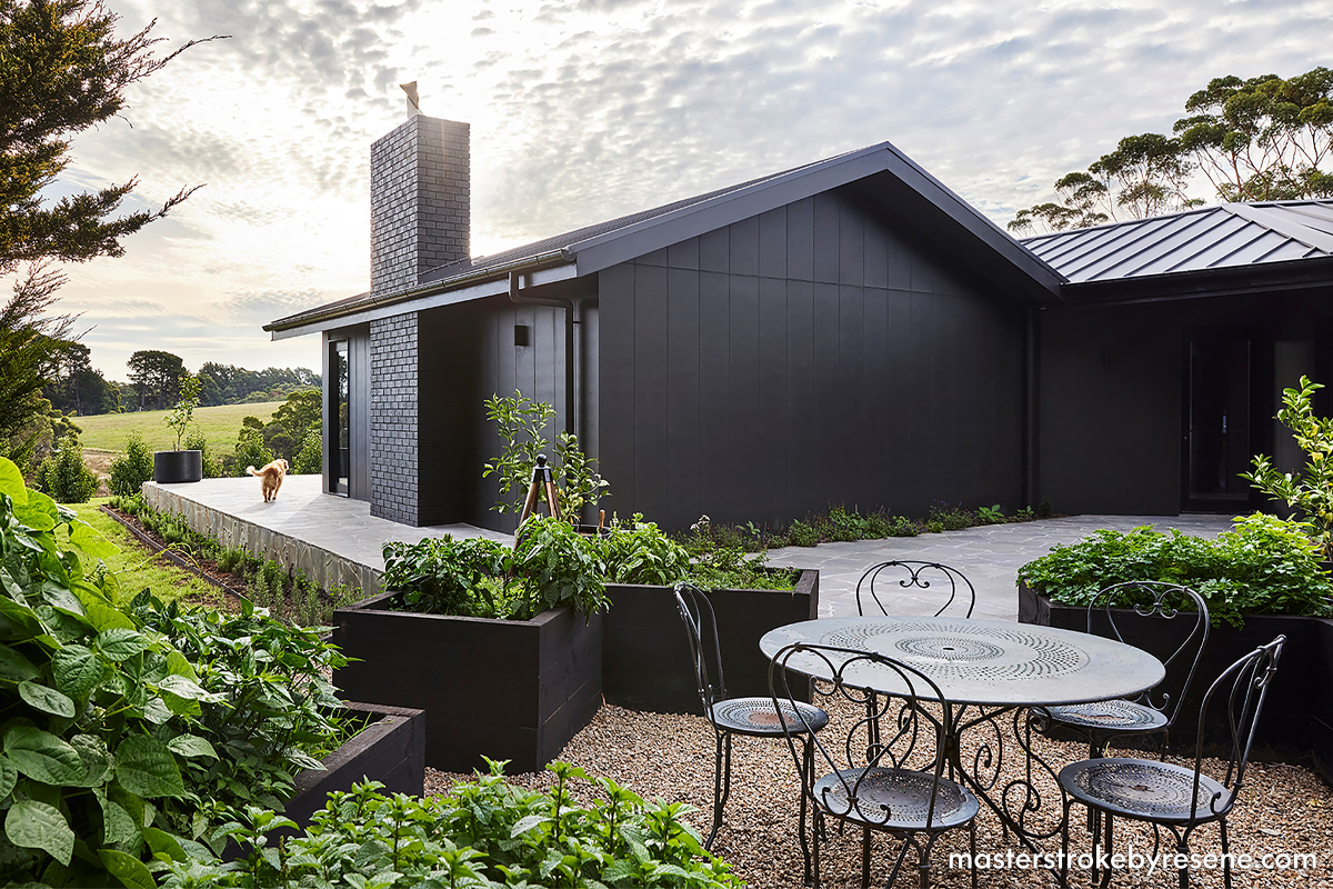
Which white works best for interiors?

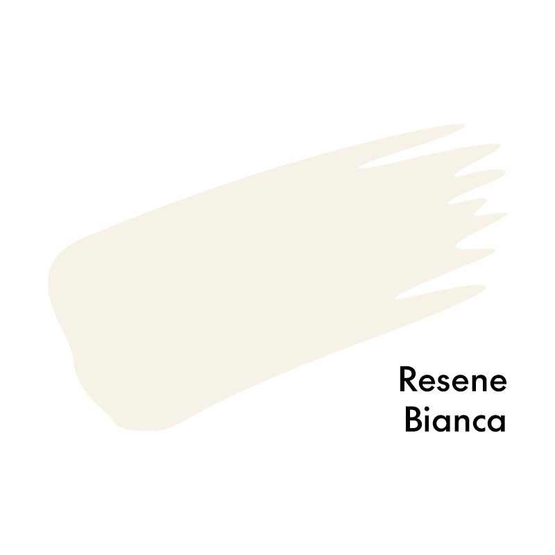
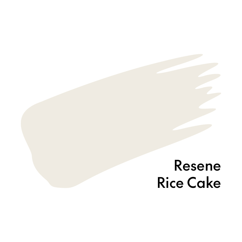
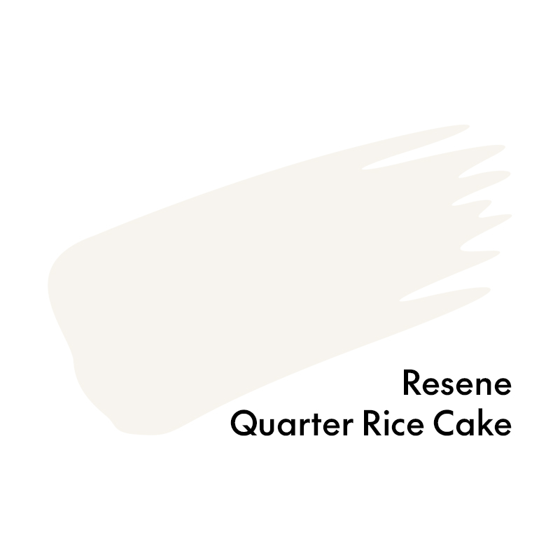
This depends on the aspect of the room, the architectural style and adjacent colours. It’s a myth that white can brighten a cold room. Especially if there is little natural light, it can just feel cold and uninviting – whites need lots of natural light to cool the effect and play with luminance. Warmer whites, such as Resene Bianca and Resene Rice Cake, are trending and the deeper variants can work for cooler spaces, while texture, pattern and deeper neutrals for accents will help to visually warm a white room.

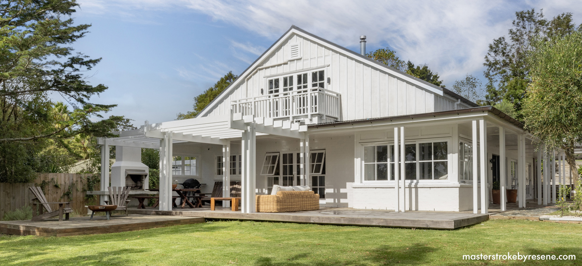
Which white works best for exteriors?

We tend to specify the deeper variants of a colour for exterior claddings, as they are more forgiving to the environment around them. This does depend on the location – for example, if you have an inner-city villa which is shaded by other houses and has deep eaves, then a white roof and brighter whites can be an option. Note that all colours appear lighter outside due to the way the natural bright light falls on the colour. White, being the most reflective shade, can become quite glary.

If you’re choosing a white exterior, make sure you allow for extra contrast than you might inside. For example, consider using a triple strength of your white on the walls and a full strength on walls. The Resene whites & neutrals collection makes this easy to do with up to six strength variations of the most popular whites.

House exterior painted in Resene Black White. Photo by Courtney & Co.

Which colours work best for which aspect? 

Colour is a chameleon and it will change if it can. Natural and artificial light is the single most important aspect when deciding on a colour, as it can and will affect the way a colour appears. However, it isn’t always quite so simple as changing a light bulb. Other design features and external or internal influences come into play – things like tinted glass, surrounding trees, adjacent paint colours, texture and even furniture can all play a part in how a colour performs, and can also be used to manipulate colour.

As a general rule, south-facing rooms have a cool grey light and they’ll benefit from warm neutrals such as Resene Biscotti, Resene Half Canterbury Clay, Resene Meringue, Resene Bone or Resene Anglaise

North-facing rooms have all-day sun and benefit from cooler, denser colours such as Resene Double Sea Fog, Resene Half Lemon Grass, Resene Emerge, Resene Quarter Linen or Resene Halcyon.

East and west-facing rooms benefit from complex neutrals as they incorporate a brighter early morning light, but by afternoon the light becomes shadow. In the morning, for example, blues or greens might become more intense but feel cool later in the day. These rooms need more consideration depending on when they are being used, but typically try colours such as Resene Half Tea, Resene Awaroa Bay, Resene Half Grey Olive, Resene Cararra or Resene Quarter Drought.

Which sheen level shall I select?

The sheen level is usually determined by where or what you are painting. A variety of finishes can create a bit of impact in a monochromatic scheme. However, it does depend on the mood you are trying to create, and whether you’re wanting to highlight detailing or hide imperfections. 

Flat paints such as Resene SpaceCote Flat are good for ceilings as they diffuse light and help conceal surface imperfections. Low sheen formulas like Resene SpaceCote Low Sheen and Resene Zylone Sheen are popular for walls as they have a tough, durable finish and are great for feature walls and high-traffic areas. Flat and low sheen paints bring out the moodiness in deeper colours and help to create a cosy ambience.

Semi-gloss and gloss finishes are great for emphasising details – they intensify colour making it seem brighter and can show imperfections on surfaces, but they are super durable and are great at reflecting light. Resene Lustacryl semi-gloss and Resene Enamacryl gloss are waterborne enamels that are a good choice for cabinetry, skirtings, doors or anywhere a higher sheen level is desirable. Resene Super Gloss enamel is perfect for a rich finish to a deep or bold colour for your front door. 

The glossier the finish, the more hard, clean and dramatic the look, so consider what ambience you’re trying to portray before deciding on your paint finishes.

Wall painted in Resene Biscotti. Wall art, dining table, rug and planter stands from Nood.
One colour can look completely different in different sheen finishes, as well as work much better in some areas of your home than others. This board shows sheen differences of the colour Resene Black.

Should we paint the ceiling, walls and trims the same colour?

There is something elevated and fun about layering a colour within a space. Before, painting your room one colour consider these points:

  • Do you want to create a snug feel or do you want to optimise space?
  • Colours on standard height ceilings appear in shadow, so a ceiling painted the same colour as the walls, can appear darker than the walls and visually lower the ceiling.
  • Rooms with angled ceilings and attic ceilings can benefit from all substrates being one colour as it creates a seamless finish, just as painting a ceiling with an ornate moulding can create a seamless finish and make it appear higher.
  • A larger-than-usual space can be a bit boring and seem lost with one colour on all substrates. The room needs to be dressed well – texture, pattern and hints of metallic  will elevate the space.
  • If you have beautiful ornate skirtings and strong doors, do you want to hide them or highlight them?

Soft whites like Resene Alabaster or Resene Half Black White are popular ceiling colours because they reflect the most amount of light, making a space appear larger.

Should we paint the native timber?

This is a tricky one because it is personal preference. If you want to really modernise the overall appearance of a home with lots of timber, painting or staining it can sometimes be the only way to streamline its appearance.

When people in a household are divided, I ask them to look at the timber they are referring to. Quite often in traditional homes, they are not considering the beautiful timber flooring and are only concentrating on what is vertical. Once that’s brought to their attention, they realise that when the dated timber is painted, the floor becomes the feature of the space.

Another consideration is to leave small features of timber unpainted, such as open shelving. Or perhaps you have a beloved piece of timber furniture that is lost amongst all the other timber – this can be rejuvenated by adding Resene Colour Enhance to Resene Aquaclear, which will refresh the natural appearance of the piece. You could also try Resene Colorwood Whitewash or the Resene Colorwood We Speak Beach stain washes to add a soft wash of stain colour that will still allow the grain to show through.

When done properly, painting timber can refresh, brighten and modernise a space. Pine ceiling painted in Resene SpaceCote Flat tinted to Resene Quarter Rice Cake.
House painted in Resene Bokara Grey and planters stained in Resene Woodsman Crowshead. Design by Atlas Architects, photo by Tess Kelly.

I love the colour of this house. Will it work on mine?

We all see colour schemes we admire and hear of colours that just work, but that doesn’t necessarily mean that those colours will work in your space, add value or give your house the wow factor.  

Unless your house is in the same location, made of the same material and has a similar architectural style, then the same colours can look dramatically different. There are colours which simply look better on weatherboards opposed to plaster – texture will affect how a colour performs, as will adjacent colours such as those on window joinery or roofing. 

Even if you love the colours someone else has used, always try them out in your own place using Resene testpots or Resene A4 drawdown paint swatches to check they work. Remember to view them during the day and at night and move the samples around your room. You may find you need to adjust to colours with more or less warmth or more or less depth of colour to bring out the best in your place.

When you’re using a testpot, always paint it onto a large piece of cardboard leaving an unpainted border around the edge. Use two coats and allow it to dry before deciding whether you like it. Never paint a testpot directly onto your wall as the existing wall colour will affect how your new colour looks.

About MasterStroke by Resene
MasterStroke by Resene is here to help you master your paint and decorating DIY projects. Brush up on your skills with advice, tips and ideas from our trusted experts.

Check out the latest how-to videos on our YouTube channel.